

The Second app, Task - Everything is Graphical, started the design work mid may. The app was mainly focused on productivity and nothing else.
The main focus was to keep all the screens as clear as possible, with the limited buttons.

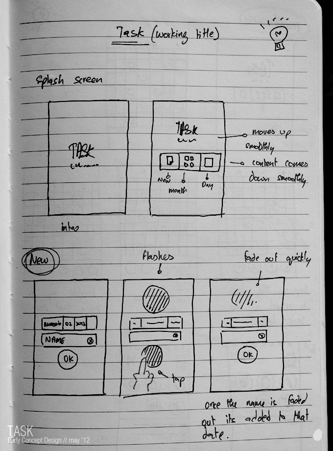
We never thought about the settings screen when we started the early concept. The main menu had only three icons overall.
New, will create a new task and later changed to 'Create New'. Month, will have the monthly view and later changed to 'Calendar View', and Day, which will have the task on the the current day and later changed to 'Daily View'. Settings and tutorials was added later.
Calendar View was came out almost the same as the initial design, we didn't change much on the dates and the bottom icon scrolls. The only thing changed was the top section where you can able to change the month and year.
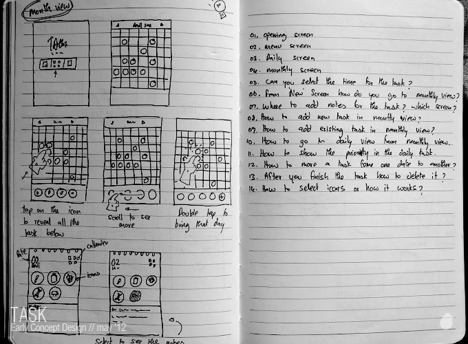
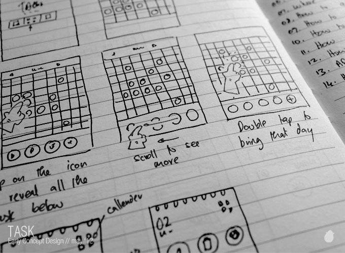
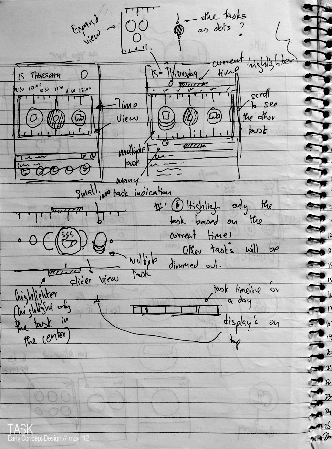
I didn't want to have the clock view as a separate screen. The idea was to place a timeline on the daily view for clock and the task are displayed right below the it. Suppose if you have more task on a same time, then it will be grouped as one.
We had some issues on the navigation side and it was too clutter and hard to focus so we changed the deisgn completely.
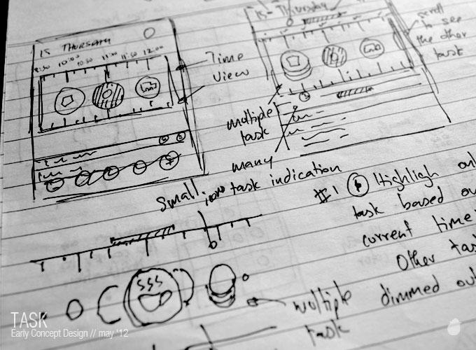
All the tasks are displayed in two rows in the 'Daily View' Screen and if you have more task it will be display on the next page where you can swipe to see.
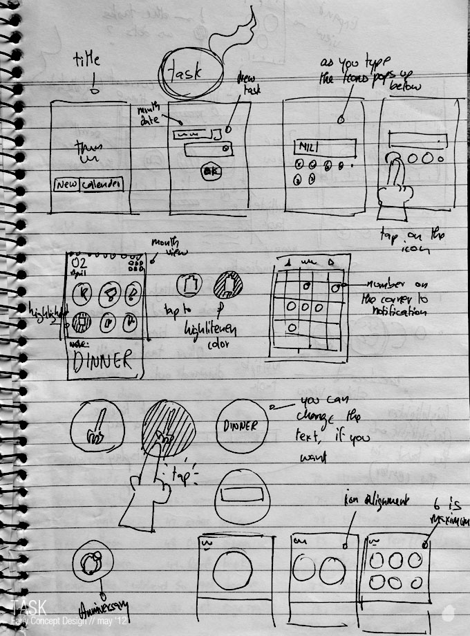
Having tags to the task took more amount of time and research.
The main focus was to keep all the screens as clear as possible, with the limited buttons.
We never thought about the settings screen when we started the early concept. The main menu had only three icons overall.
New, will create a new task and later changed to 'Create New'. Month, will have the monthly view and later changed to 'Calendar View', and Day, which will have the task on the the current day and later changed to 'Daily View'. Settings and tutorials was added later.
Calendar View was came out almost the same as the initial design, we didn't change much on the dates and the bottom icon scrolls. The only thing changed was the top section where you can able to change the month and year.
I didn't want to have the clock view as a separate screen. The idea was to place a timeline on the daily view for clock and the task are displayed right below the it. Suppose if you have more task on a same time, then it will be grouped as one.
We had some issues on the navigation side and it was too clutter and hard to focus so we changed the deisgn completely.
All the tasks are displayed in two rows in the 'Daily View' Screen and if you have more task it will be display on the next page where you can swipe to see.
Having tags to the task took more amount of time and research.
No comments:
Post a Comment